The Evil Bean: in the clutches of "demon" coffee.

click on the image below to download PDF:

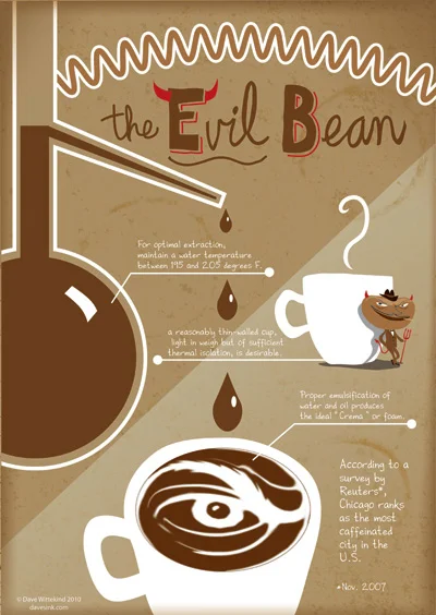
As addictions go, it could be worse. In fact, it seems like every year there are studies revealing as many health benefits (lower Parkinsons, diabetes and dimentia rates) to coffee intake as there are negative effects (higher blood pressure, heart rate, and possible irregular heartbeat).

If you are a home barista or, if you're as lucky as I am, a spouse makes your lattes and espressos for you, there are methods to coffee brewing that can seem mysterious to the uninitiated. Timing is important and starting with fresh beans and clean equipment is crucial.

As part of my tireless research for this subject, I ran across this tidbit: The most expensive cup of coffee (about $50 US) is called Kopi Luwak and comes from Indonesia. It's distinguishing characteristic and what makes it so pricey is the fact that every bean is harvested from the droppings of a small mongoose-like animal called a luwak, which ingests the coffee berries and excretes the beans whole. Sounds gross, but because the luwak's digestive system breaks down some of the proteins associated with bitterness and also because the animal only chooses the tastiest coffee berries to begin with, the result is reportedly one smooth and satisfying cup o' joe.

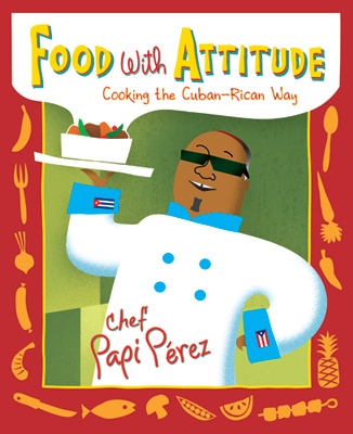
Cover art for "Food with Attitude" by Chef Papi Pérez

Here's a cover I did recently for a soon-to-be-published cookbook: "Food with Attitude: Cooking the Cuban-Rican Way".

From the Chef Papi Pérez Facebook Fan Page (which includes a fantastic and unique recipe for hummus) :

"Join Chicago’s very own Chef Papi Pérez on a culinary journey where flavor and health-conscious food go hand-in-hand. In this unique cookbook Papi Pérez shares recipes from his many years as a certified Kosher chef and restaurant consultant."

It's being published by Wicker Park Press Ltd. and will sell for $27.95.

Chris Ware and Charles Burns at Unity Temple

UnityTemple in Oak Park, IL

UnityTemple in Oak Park, IL

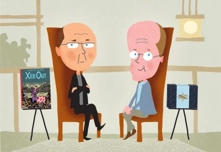
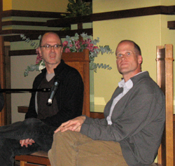
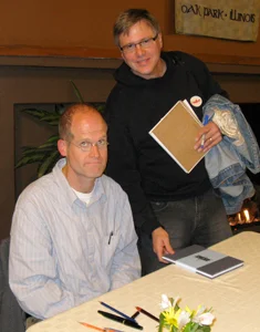
An audience of about 200 fans was afforded a rare opportunity to see and hear two modern masters of the graphic novel, Chris Ware and Charles Burns. The setting was Oak Park, Illinois' beautiful and historic Unity Temple, built by Frank Lloyd Wright, which is undergoing an extensive and much needed renovation. In addition to numerous structural issues, recently there was news that vandals had stolen the bronze lettering above both entryway doors. Chris Ware, best known for his masterful "Jimmy Corrigan: the Smartest Kid on Earth", is an Oak Park native, and Wright's prairie style comes through in the clean architectural precision of his work. Charles Burns, the senior of the two and one of Ware's "childhood heroes", on the other hand, claims to be no good at rendering mechanical objects and says he relies heavily on photo reference for things like cars. His latest work is the nightmarish "X'ed Out".

Throughout their presentations, both artist's came across as genuine, modest, and reserved, somewhat surprising given Burns' roots as a "punk comic artist" (Both have had work published in the alternative "Raw magazine"). Both Ware and Burns share a mastery at getting under the skin of their characters and exposing their darkest sides and most disturbing thoughts. Much of their imagery and story lines are aimed at mature readers in every sense of the word.

When asked if they ever had to police their own thought processes in order to avoid offending family and friends (both are now family men), Burns said that he has to consciously fight the temptation to censor his darker themes in order to avoid dulling his art. Ware said he isn't sure where his darker themes of family dysfunction come from, as he grew up in a comfortable, middle class home environment. Both confessed to occasional awkward conversations with a parent, having to explain that "The mom and dad in the story are purely fictional...REALLY!"

At the book signing following the presentations and Q & A, both artists were personable and the fans patient despite long lines. Given Ware's methodical signature style, I wouldn't be surprised to hear that the line is still snaking throughout the temple.

Many thanks to Chris Ware and Charles Burns and to Oak Park's "Book Table" book store for arranging the event and to the Unity Temple for hosting. A portion of the event's book sale proceeds go toward the Unity Temple Restoration Foundation".

Zen and the Art of Whiteboarding

ZenMaster02

ZenMaster02

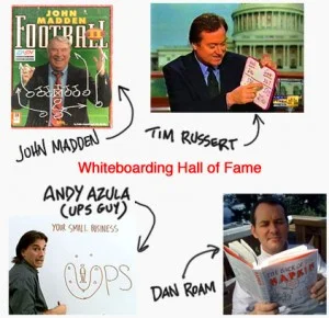
Though it's been around in some form since man's earliest days, whiteboarding has become an important component of corporate brainstorming or "ideation" as it's sometimes known. What started as a simple, ambulance low-tech presentation method has spawned a cottage industry of seminars and consulting businesses and books. Whiteboarding is all about communicating complex ideas or abstract concepts in a simplified manner. And with the growth of international business, communication has become more important than ever, and what better way to bridge a language and cultural divide than with simple pictures? I, and others looking to expand the role of graphics professionals, have noticed this trend, and would love to find a niche market for graphic artists in this new/old medium. With this in mind, I set out to investigate whiteboarding from an illustrator's point of view. Maybe it's making up for the years of alpha-male-dominated climate in the business world, but the whole idea behind "ideation" may seem a bit "new age-y", starting right with the word, "ideation"(?) and continuing with one of it's core principles: "There are no bad ideas." (Really?? I think I've come up with a few stinkers at one time or another that would qualify.) Then there are some brainstorming exercises involving haiku poery or something called "laddering". So in exploring whiteboarding techniques, I find the challenge is to cut through some of the ethereal stuff and actually DRAW something that makes sense. Something that everyone (or nearly everyone) in the room can understand.

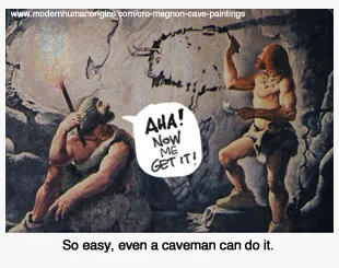
There've been several books on the subject, most notably "The Back of the Napkin" by Dan Roam. For a book dealing with how best to convey ideas simply through the use of pictures, I found it to have a lot of...well... words. After wading through all the acronyms (SQVID?) and bullet-point lists, I found the information overload to be somewhere in the realm of Steven Hawking's "Brief History of Time". To be fair, the book's main market is business people who want to bridge the communication gap between other business people, so they be more accustomed to the business-speak in "The Back of the Napkin". The book clearly isn't meant as a "how-to" for illustrator's looking to tap into the whiteboarding market. In fact , one of Roam's main points is that "anyone can do it". While I'm sure that's true to an extent, I can't help but feel there must be SOME advantage to being able to draw when hitting the whiteboard. After all, ANYONE can play Pictionary, but when an illustrator's playing, the smart money is on them. In the end, one comforting point that I got from the book is that people respond and pay attention to hand drawn pictures better than they do to the average Powerpoint slide presentation, even if they present similar graphs and information. In fact, Roan freely ackowledges that many of the standard whiteboarding symbols (arrows, primitive shapes) come directly from Powerpoint and are proven to best convey certain concepts. And since most modern illustrators are used to working with metaphors and translating abstract ideas into clear visual terms, it seems to follow that illustrators would be naturals at whiteboard presentations, provided that they possess a certain degree of "people skills" (not always a given). More information about whiteboarding and examples of it in use can be found at the following links: Way of the Whiteboard (Dan Roam video)Ideation and Design Principles

So now it's time to hone those quick sketch skills. Who's up for a round of Pictionary?

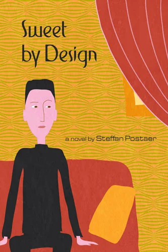
"Sweet by Design" book cover submission

Author and adman Steffan Postaer has found a clever means of introducing his latest novel. He's been posting the entire book, Sweet by Design, chapter by chapter on his website and has invited the public to submit proposed covers which he also posts. The book itself is a great read and many of the cover entries are wonderful. Here's mine. Feedback is welcome, here or on Steffan's site!